Latest Entries »

“No matter how cool your interface is, less of it would be better.”

–          Alan Cooper “About Face”

According to the Webster Dictionary, the term transparency literally refers to the quality or state of being transparent;

–          Fine or sheer enough to see through

–          Free from pretense or deceit

–          Easily detected or seen through

–          Readily understood

The transparent interface is commonly defined as one that maximizes user task completion and minimizes interfering factors, such as unnecessary interface complexity or performance. Transparency means that information or actions are clear, truthful, and easy to understand.

Minimalism describes the movement in various forms of art and design where the work is reduced to its necessary elements. Minimalists reduce their work to the smallest number of colours, values, shapes, lines, and textures The aim of Minimalism is to allow the viewer to experience the work more intensely without the distractions of composition, theme and so on

Minimal Art emerged as a movement in the 1950s and continued through the Sixties and Seventies. Minimalist artists rejected the idea that art should reflect the personal expression of its creator. There was a lack of emotion and subconscious decision-making in minimalist art, hiding the presence and feelings of the artists. Rather, the artists believed that the viewer’s personal reaction to the object was of higher importance, and thus strove to eliminate the presence of the creator in their work.

Below are some examples of minimalism in different artistic fields.

Advantages of a Transparent Interface

“A triumvirate exists between our mindware, which is the mental circuits we possess, our mindset, which results from training and experience, and the hardware which is used to sense and present information to the operators of modern machines.” – Richard Malcolm “The Challenge of the Transparent Interface”

In the past it had been accepted that to use a new machine, a person will require training in its operation. This mindset was carried over to software design and lead to the need to retrain staff frequently, at a large cost to the corporation. But, if we program to the user’s ‘mindware’ the operation of the interface will become transparent. Rather than have a user learn new skills, create a program that uses the skills they already have.

Take Apple for example. No matter what product they are bringing out, it is always designed with an interface that will seem familiar to their previous customers. Users would much rather be successful than knowledgeable and the less time a user takes to learn to use a product, the higher the probability that the product will be successful. They would be much more likely to buy the product that works with the skills they already have.

Why and When to use Minimalism

The purpose of a good web design is to enhance the focus on the products or services offered, or the content as a whole, so it can be used by everyone and is easy to understand and navigate through.

Minimalism brings the most important content to the forefront and minimizes distractions for the user. If a page has too many elements, the viewer will be confused about where to look or misinterpret the priority of each element. A minimalist design puts the focus squarely on the content.

The point is not to make the website less functional, but rather to cut out unnecessary elements (and thus highlight the necessary ones) or to combine sections into a simpler layout. By putting focus on the content minimalist design makes it easier for the viewer to interpret and understand and the risk of misunderstandings and confusion is reduced compared to design that is completely stuffed up.

Another advantage of these websites is that they generally load very quickly due to the lack of clutter.

You might think that a minimal interface / website requires the creation of less graphical content and so would be easier and cheaper to make. But creating a true transparent interface takes a lot of time and skill and usually starts with content that gets striped away. To see some people that have succeeded, check out –

–          http://www.pandaweb.us/

–          http://www.aftermodernlab.com/php/profile.php

–          http://www.thoughtandtheory.com/

–          http://www.petercrawley.co.uk/

–          http://www.jonaslindvall.com/

–          http://www.dannyguy.com/

Sometime Less is Just Less

“The minimalist wants the fruits of a certain toil but does not want to toil. Minimalism breeds mediocrity. It is the destroyer of passion. Minimalism is one of the greatest character diseases of our time. It is the enemy of excellence and a cancer on society.” – Matthew Kelly, “The Rhythm of Life”

Minimalism is not about sacrificing things we want, or having less for austerity. Minimizing the number of thoughts and things that block the path to what we truly want becomes a facilitating strategy. Dispensing with fluff and getting to the heart of the data isn’t always the same thing. Many things on most websites are unnecessary – they look attractive or are interesting reading but don’t really accomplish anything specific. Minimalism on the other hand focuses almost exclusively on the key points. Supplementary features are sometimes what makes certain types of websites so successful. Minimalist websites should be the most usable websites, because nothing is there to confuse or get in the way; and the text is thought out extra carefully. Often though, with little on the page, visitors have difficulty figuring out where to go.

Self Magazine - The clutter is the point.

Graphics may seem unnecessary when you can create a text based website that will load quicker and be cheaper to make. If your website offers a unique function the user will usually want to get to that function as quickly as possible so an uncluttered page works. However, many user are also on the internet for entertainment without graphic, icons, or animation, you could have a web-page with nothing to engage the user. Brochure websites are an example of this: basic information with no distinct message. Many websites could benefit from more content, though, as well as more visual stimulation. The main point is to find the true purpose of the product and remove elements until the design no longer achieves that purpose. You want your design to be just on the verge of braking while still functioning.

Summary

Transparency is a vital aspect of Human Computer Interaction and is linked closely to issues of clarity and usability in user interface design. Systems and programs that are transparent for the user mean that they can operate with ease and with little attention to detail.

The goal of true minimalism is not to have a bare-bones design, but to have a design where only the best parts are kept. Before removing anything from a design make sure it is not part of the purpose of the design. However, go too far and you can end up with an unsatisfying user experience.

The deciding factor may be the target audience’s sensibility, the client’s goals or the way visitors will use the website. But there is an appropriate style for each website, and the decision should not be taken lightly. Many people in non-design-related fields don’t fully appreciate minimalist design or even find it visually appealing. And because the vast majority of Internet users are not creative types, we have to respect this view and address it accordingly.

Color offers an instantaneous method for conveying meaning and message. Our minds are programmed to respond to color. We stop our cars for red lights and go on green, we look at the color of certain plants and animals to determine whether or not they are safe for us to eat or touch, the bottom line is that color is a very important part of our daily lives. Symbolic meanings of colors have psychological connotations. Nevertheless, colors effect us psychologically regardless of any symbolism. And the psychological effect of one color can be very different from its symbolical significance.

If you understand the psychological effects of colors, you can employ them  deliberately. While perceptions of color are somewhat subjective, there are some color effects that have universal meaning. Colors in the red area of the color spectrum are known as warm colors and include red, orange and yellow. These warm colors evoke emotions ranging from feelings of warmth and comfort to feelings of anger and hostility. Colors trigger a variety of emotions and memories. The interpretation of color depends on age, profession, nationality, and personal preference.

Here are some general interpretations of colour psychology;

RED
Positive: Physical courage, strength, warmth, energy, basic survival, ‘fight or flight’, stimulation, masculinity, excitement.
Negative: Defiance, aggression, visual impact, strain.

YELLOW
Positive: Optimism, confidence, self-esteem, extraversion, emotional strength, friendliness, creativity.
Negative: Irrationality, fear, emotional fragility, depression, anxiety, suicide.

GREEN
Positive: Harmony, balance, refreshment, universal love, rest, restoration, reassurance, environmental awareness, equilibrium, peace.
Negative: Boredom, stagnation, blandness, enervation.

PINK.
Positive: Physical tranquillity, nurture, warmth, femininity, love, sexuality, survival of the species.
Negative: Inhibition, emotional claustrophobia, emasculation, physical weakness.

GREY.
Positive: Psychological neutrality.
Negative: Lack of confidence, dampness, depression, hibernation, lack of energy.

BLACK.
Positive: Sophistication, glamour, security, emotional safety, efficiency, substance.
Negative: Oppression, coldness, menace, heaviness.

WHITE.
Positive: Hygiene, sterility, clarity, purity, cleanness, simplicity, sophistication, efficiency.
Negative: Sterility, coldness, barriers, unfriendliness, elitism.

BLUE.
Positive: Intelligence, communication, trust, efficiency, serenity, duty, logic, coolness, reflection, calm.
Negative: Coldness, aloofness, lack of emotion, unfriendliness.

So the main reason I chose blue for my logo is because of the word – Thought = intellect, logic and intelligence. Also blue is the overwhelming “favorite color.” Blue is seen as trustworthy, dependable and committed. The color of sky and the ocean, blue is perceived as a constant in our lives.

Many people have used blue to convey intelligence, here are but a few examples;

I have not even scratched the surface of colour theory, but if you wish to delve deeper then the following sites are a good place to start.

Because a – no one could see the figure without me pointing it out; and b – it wasn’t necessary, I took the question and exclamation mark out of the design, simplifying the design. And created this 3-colour design to show how it would work in colour on both black and white background, and that it would work in black and white on either background

My reasons for choosing blue can be found in the post – Why So Blue.

Then in further discussions I found out that people didn’t see the speech balloon shape, even though I can’t help but see it. But the shape was pleasing and the backwards ‘g’ ‘h’ and ‘t’ still received the ‘amused’ response that I wanted. So I created one final iteration –

Then I began to experiment with colour in greater detail. For the purposes of cost and efficiency, I looked into the Pantone colour; matte to be specific.

In the end I decided on Pantone Solid Matte 298M and the font is Gills Sans Ultra Bold.

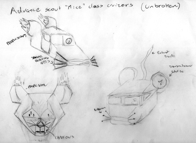
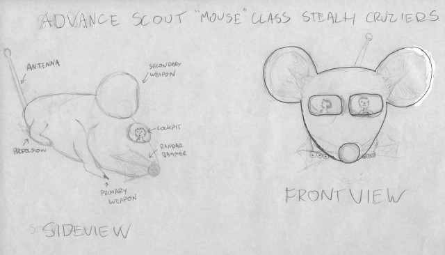
One of the things we were challenged to do while developing the characters for ‘Three Blind Mice’ was to come up with some iterations that weren’t mice. My thought was to make them space ships.

Three different ideas for the ships.

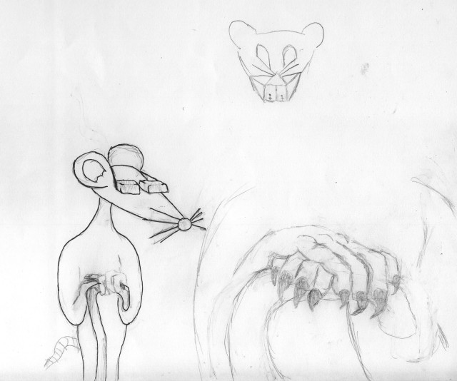
What I thought was the final attempt on this idea, the ship became the head for a character I developed further.

This guy started as a ship.

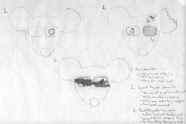
Shortly after, we were given a new assignment that would use our designs to create a storyboard for a game, so I revisited the ship idea.

To make the ships individual, I gave them different damage.

But I once again moved back to creating actual characters.

Towards the end of my design sketches I started to experiment with the use of question marks and exclamation marks, as can be seen in my last post of my design journal. While doing this I noticed that, when put together the right way, you can kind of make it look like a person. That lead to the sketch below.

The illusion's not quite there.

After sketching this I began experimenting with what is supposed to be the speech bubble.

Then it was suggested to me that I should try using fonts that already exist to create the design.

After sorting through fonts for a question mark that will enhance my concept, I combined it with the font ‘Gill Sans’ to create the iteration below.

Checking out various ?

.

Then I messed around with the placements of the elements to see if the effect held up.

In the book “Hero With A Thousand Faces”, Joseph Campbell put forth the concept that every story in the history of man has been the same basic tale. Or at least follows the same formula.

For our first solo storyboard, we asked to create a storyboard for the third stage of Joseph Campbell’s omni-tale.

  • The hero denies the call to adventure.

Below is a quick attempt at this task, that took half the time we were given in during class.

What this storyboard hopefully shows it a guy playing video when the phone rings. This breaks his concentration and causes him to lose his game. He totally ignores the phone itself and goes to the kitchen to get a drink. By the time he gets to the kitchen the phone has stopped ringing, but starts again while he has he head in the fridge. He continues to ignore the caller and goes back to his game, but before he starts playing someone, possibly the person calling on the phone, throws a rock through the window with a message attached.

Because I had more time to finish the storyboard, I decided to redraw some of the more important frames in greater detail. I redrew the following three scenes before running out of time.

The next scene I would have redrew is the shot from within the fridge.

Click on image to see other great movie posters

Good design means as little design as possible. If you can remove an element within a design and that design still works, then you’ve practiced economy in design. There are no rules for using economy, if an element works in the composition with respect to the whole design, it should be kept. If it distracts from the desired effect, it should be re-evaluated for its purpose.

Graphic design is for identification, information, presentation and promotion. Economy of design furthers the concept of telling a short story with images. Everything needs to justify its continued existence. If you wish to retain something for the sake of tradition let that be a conscious decision.

This is a key goal in the case of user interfaces as economy breeds simplicity. Taking away from an interface means that there is less for a user to understand. Simplicity does not mean simplistic solutions, lack of functionality or limited information

“Simplicity is the ultimate sophistication.” – Leonardo Da Vinci.

Below are some logos that I have gathered which show economy in design.

For some more opinions on Economy and Simplicity, visit the following sites;

‘In Om we have no word for slave,’ said Vorbis.
‘So I understand,’ said the Tyrant. ‘I imagine that fish have no word for water.’
— Terry Pratchett – ‘Small Gods’.

You can’t name a thing that could not be contrasted to some other thing based on any of its aspects: color, size, shape, font, texture, etc. A word does not need to be created for a state of being that has no opposite. Up – Down. Light – Dark. Alive – Dead.

This artist goes by the name Nebezial

Contrast occurs when two elements are different. The greater the difference the greater the contrast. The key to working with contrast is to make sure the differences are obvious. Four common methods of creating contrast are by using differences in size, value, color, and type.

Contrast in design is an accentuation of the differences between elements in a design. Most people think of contrast only as it applies to colors, but contrast can work with any design element. For example, if you have a group of lines that are all the same size, there is no contrast. But if one is a lot longer than the others, it contrasts with them.

If all the art elements are the same, the result is monotonous and unexciting. Contrast aids in readability by making headlines and subheadings stand out. Contrast shows what is important by making smaller or lighter elements recede on the page to allow other elements to take center stage.

Contrast is most effective when it is strong; the focal point of a design is usually a result of contrast where the eyes will naturally be drawn. It is important to remember that an ineffective use of contrast may result in confusion.

Below I have posted logos that I have found that have strong contrast.

For more information and opinions on the use f contrast in design check out the following sites;

Variety provides contrast to harmony and unity and consists of the differences in objects that add interest to a visual image. Variety can be achieved by using opposites or strong contrasts, changing the size, point of view, and angle of a single object can or breaking a repeating pattern can enliven a visual image.

In the Valley - Jasper F. Cropsey

By varying the components of a visual design, the artist creates interest and avoids monotony. A way of accomplishing this is to establish an approach which involves theme and variations-repeating the same image, but in different sizes, colors, values and shapes. Variety is the complement to unity and is needed to create visual interest. Without unity, an image is chaotic and “unreadable;” without variety it is dull and uninteresting. In Cropsey’s painting on the left, ‘In the Valley’, the large tree creates a variety in contrast to the architecture in the distance, creating a visually pleasing image.

Good design is achieved through the balance of unity and variety; the elements need to be alike enough so we perceive them as belonging together and different enough to be interesting. An effective way to integrate unity and variety is by creating variations on a theme. Just as a composer can repeat and vary a musical theme throughout a composition, a designer can repeat and vary an element throughout a design.

Below is some work from other designers that shows the use of variety –

Some more information on variety can be found at the following sites;

Unity discusses the need to tie the various elements of a work of art together. A unified work of art represents first a whole, then the sum of its parts. When all the elements in a work look as though they belong together, the artist has achieved unity.

You know unity has been achieved when all aspects of the design complement one another rather than compete for attention. All of the design principles (balance, movement, emphasis, visual economy, contrast, proportion and space) have been correctly applied. Everything selected for use in a composition must complement the key theme and must also serve some functional purpose within the design.

American Gothic

Unity can be achieved through the use of;

  • Similarity of shape, colour, line, ect
  • Proximity
  • Repetition
  • Alignment
  • Continuation
  • Consistent use of graphic elements

When unity is achieved:

  • The individual elements with in a composition will not be competing for attention.
  • The key theme will be communicated more clearly.
  • The design will evoke a sense of completeness and organization.
  • When nothing can distract from the whole you have unity.

The well-known painting “American Gothic” shows unity in its repeditive use of elongated curves and similar colours.

Unity in composition is hard to achieve, but below are a couple of logo whose designers at least came close.

More info on unity in art can be found as these sites;