Archive for May, 2010


Unity discusses the need to tie the various elements of a work of art together. A unified work of art represents first a whole, then the sum of its parts. When all the elements in a work look as though they belong together, the artist has achieved unity.

You know unity has been achieved when all aspects of the design complement one another rather than compete for attention. All of the design principles (balance, movement, emphasis, visual economy, contrast, proportion and space) have been correctly applied. Everything selected for use in a composition must complement the key theme and must also serve some functional purpose within the design.

American Gothic

Unity can be achieved through the use of;

  • Similarity of shape, colour, line, ect
  • Proximity
  • Repetition
  • Alignment
  • Continuation
  • Consistent use of graphic elements

When unity is achieved:

  • The individual elements with in a composition will not be competing for attention.
  • The key theme will be communicated more clearly.
  • The design will evoke a sense of completeness and organization.
  • When nothing can distract from the whole you have unity.

The well-known painting “American Gothic” shows unity in its repeditive use of elongated curves and similar colours.

Unity in composition is hard to achieve, but below are a couple of logo whose designers at least came close.

More info on unity in art can be found as these sites;

“I can’t understand why people are frightened of new ideas.
I’m frightened of the old ones” – John Cage

After coming up with a name for my company, I began brainstorming ideas. After looking at some of the ‘would-be’ competitors and there logos/marketing. I found a few Australian companies on the web and learnt that the more entertainment based designers had animated logos.

From this I decided that I decided that I should come up with animated logo for my animation company. In the first concept I had thoughts, (the letters spelling “Random Thought” falling out of a box. A play on the cliché ‘Thinking outside the box’. In the top left hand corner of the image below, you can see where I sketched this first idea.

If you follow the arrows you may notice how the design evolved through slight iteration in typography, (except for the brain design, I have no idea where that came from), into the full-page sketch below.

'Thought' created with pen tool.

After taking this design into Illustrator, I sat down and drew up a few different iterations.

These images lead to the two iteration below and a third idea that will be discussed in the next post of my design journal.

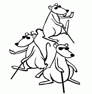
For the project D1-1 the class was given the task of designing characters for an animation based on the three blind mice that was marketed for mature audiences.  The image had to evoke empathy for the mice and the scene had to be tense and uneasy.

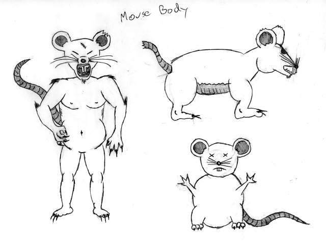
These first iterations were to see what type of mice I could draw best.

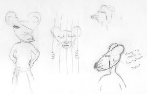
This set of drawings are an exploration of personalities.

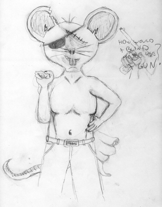
When asked to create a hero iteration I developed this one more.

For the project D1-1 the class was given the task of designing characters for an animation based on the three blind mice that was marketed for mature audiences.  The image had to evoke empathy for the mice and the scene had to be tense and uneasy.

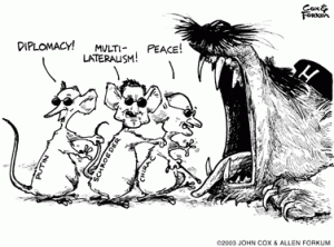
The first thing I looked into was the origin of the three blind mice rhyme. Then I looked at ways other artist have approached this task. Below are some of the images I found during my search.

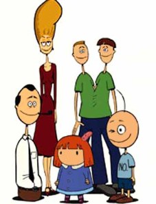
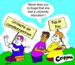
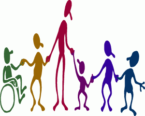
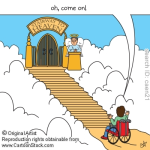
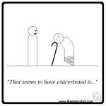
After that I looked into cartoon depiction of other kinds of disabilities and came across the following images.

A visual representation of human needs.

Maslow’s hierarchy of needs refers to what people need to survive and be happy. They are listed in order of importance and having any of them is irrelevant unless you have all the predeceasing needs. Maslow’s hierarchy of needs is most often displayed as a pyramid,  (like the one on the left). The lowest levels of the pyramid are made up of the most basic needs, while the more complex needs are located at the top of the pyramid. Needs at the bottom of the pyramid are basic physical requirements including the need for food, water, sleep and warmth. Once these lower-level needs have been met, people can move on to the next level of needs, which are for safety and security. As people progress up the pyramid, needs become increasingly psychological and social. Soon, the need for love, friendship and intimacy become important. Further up the pyramid, the need for personal esteem and feelings of accomplishment take priority.

When it comes to design, the hierarchy of needs is quite different but, just like Maslow’s, they still need to be met in order. That order is;

Functionality – The most basic of needs. If a design does not achieve its intended function, then it doesn’t matter if it meets every other need in this list, it’s still a failure.

Reliability – Once a design meets its function, it needs to be able to continue to do this consistently through its lifespan. It should function the same way every time it is used.

Usability – We now move into the less important needs of a design. Usability refers to how easy a product is to use and how forgiving the design is towards the user. This is an important need of design, but if you have to sacrifice usability to achieve the previous two needs, then the users can get past this.

Proficiency – If your design allows people to do things better than they could before then you have achieved proficiency. Proficiency is a great selling point for a product and people will favour any product that can delivery this.

Creativity – The last and hardest need to achieve. Creativity can only be brought in if all other needs are met. The design has reached a level where user can interact, bringing their own skills and ideas into the use of a product.

The flats of London

In London, England in an attempt to solve the housing problem local councils built up buildings that came to be known as council flats. Citizens suffering financial hardships were delegated a flat and lived with the council as the landlord.

The problem with this solution was that only architecture, money and space were taken into consideration when designing the flats. Politicians believed that people would acclimatize themselves with life in these flats. But, as the hierarchy of needs was not considered, life inside these flats is hard and depressing.

The flats achieve their function and provide the basic physical requirements. Only the bottom layer of both ‘needs pyramids’ have been met. They do not feel safe or secure, nor give the residences a feeling of belonging, as they don’t actually own the place where they live. The reliability and usability are terrible as the flats are poorly made and maintained. None of the other needs can even be discussed in relation to these buildings.

Further information on these topics can be found at these sites;

Below are my attempts at creating a logo using the different laws of gestalt. Except for the last image which was something made during a class exercise.

The different laws of gestalt

Gestalt is the phenomena of seeing objects as a whole rather than individual elements. Gestalt is a German word that roughly translates as “whole” or “form.” It refers to theories of visual perception developed by German psychologists in the 1920s. These theories attempt to describe how people tend to organize visual elements into groups or unified wholes when certain principles are applied. The human mind is quite adept at finding patterns and forms with very little stimuli.

The visual world is so complex that the mind has developed strategies for coping with the confusion. The mind tries to find the simplest solution to a problem. One of the ways it does this is to form groups of items that have certain characteristics in common.

The aspects of gestalt theory that interests designers are related to gestalt’s investigations of visual perception, principally the relationship between the parts and the whole of visual experience. Gestalt can be broken down into five basic principles.

Two groups of buttons

The gap makes us see two objects

Proximity – When elements are placed close together. They tend to be perceived as a group. There is a limit to the amount of information that the mind can keep track of. When the amount of visual information becomes too great the mind tries to simplify by grouping. The general concept for proximity states that the closer items are to one another, the more likely they are to be seen as a group. When items get close enough they touch. They still are two different items but they seem to be attached together.

Four lines seen as one object

The car stands out because of the similarity of the other objects

The car is an anomaly

Similarity – When objects look similar to one another. People often perceive them as a group or pattern. When similarity occurs, an object can be emphasised if it is dissimilar to the others. This is called anomaly.

Similarity is a powerful grouping concept and as such can contribute significantly towards achieving unity. The more alike the items are, the more likely they are to form groups. The three main ways to create similarity are size, colour and shape. These and other similarity types are used extensively in design to create order and to organize information into specific groups in order to make the material presented more understandable.

They have not drawn a figure.

The figure is 'One'

Figure-Ground – This is the most abundantly used law of gestalt. Edgar Rubin, a Danish psychologist, was the first to systematically investigate the figure-ground phenomenon. The eye differentiates an object form its surrounding area. a form, silhouette, or shape is naturally perceived as figure (object), while the surrounding area is perceived as ground (background). Balancing figure and ground can make the perceived image more clear.

A simple composition may have only one figure. In a complex composition there will be several things to notice. As we look from one to another they each become figure in turn. As our attention shifts, the ground also shifts so that an object can go from figure to ground and then back. Ground is sometimes thought of as background or negative space.

We put in the last few lines.

There is neither a 'r' or a 'b'.

Closure – The law of closure posits that we perceptually close up, or complete, objects that are not, in fact, complete. This can involve the brain’s provision of missing details thought to be a part of a potential pattern, or, once closure is achieved, the elimination of details unnecessary to establish a pattern match.

Closure occurs when elements in a composition are aligned in such a way that the viewer perceives that the information could be connected. Imaginary lines called vectors, or shapes called counter forms, are generated by these relationships, which the eye understands as part of the composition even though there is “nothing there. Counter forms, (or negative spaces), determine to a great extent whether or not the composition will be perceived as a harmonious whole. Counter forms echo the positive visual elements with similarity, or create powerful substructures that support and connect visible elements.

3 lines, 3 letter, 5 shapes

Attempting movement

Continuity – When the eye is compelled to move through one object and continue to another object. The edge of one shape will continue into the space and meet up with other shapes or the edge of the picture plane. Continuity in the form of a line, an edge, or a direction from one form to another creates a fluid connection among compositional parts.

Seeing things as whole lines (sequential) is clearly important. But ‘being in wholes means’ that few interruptions change the reading of the whole. One of the best examples of continuity is the cross, which we see as one object rather than four connecting lines.

You can read more on the laws of gestalt at the following sites;

Rhythm is created when one or more elements of design are used repeatedly to create a feeling of organized movement. Variety is essential to keep rhythm exciting and active, and moving the viewer around the artwork. Rhythm creates a mood like music or dancing. It can be created by the use of repetition – the regular or harmonious recurrence of elements, progression – a sequence or transition produced by increasing or decreasing one or more qualities, and contrast – deliberate placement of elements to create opposition by abrupt transition rather than gradual.

Rhythm of Black Lines by Piet Mondrian

Rhythm allows your designs to develop an internal consistency that makes it easier for your customers to understand. Once the brain recognizes the pattern in the rhythm it can relax and understand the whole design. Repetition rarely occurs on its own and so it embues a sense of order onto the design. And because of this, repetition attracts attention and prompts customers to investigate further.

Rhythm depends largely upon the elements of pattern and movement to achieve its effects. The parallels between rhythm in sound/ music are very exact to the idea of rhythm in a visual composition. The difference is that the timed “beat” is sensed by the eyes rather than the ears. Visual rhythm may be best understood by relating it to rhythm in sound. This link will take you to a video clip and explanation of how the sound of a Nigerian “talking drum” follows the intonation and rhythm of speech.

To be effective, rhythm also requires some variability – rhythm that is too similar or perfect may be boring. Therefore when composing your images look for repetition with variation.

For other views on rhythm follows these links;

Most people would be put off

The definition of visceral is the instant response people have to stimuli. The thoughts they have before they have any thoughts.

Bernini's 'Apollo and Daphne'

Take this image to the left. Most people would see this and start to choke on imaginary hairs. I personally think it works better on people who drink tea/coffee. Since I don’t, this image brings up the thoughts of being warm and comfy. But is this my visceral or reflective response?

Visceral responses are meant to be universal. In other words, for the above image to be truly effective  it should elicit the same response from people who have never seen a teacup before, and that might not be the case.

Something that is universally known is the human form, which is why ‘Apollo and Daphne’ by Bernini might better fit into the visceral definition. The two figures appear playful and free. These thoughts would come to even those who might find the imagery offensive. Without going into it to deeply, any offence elicited by this sculpture would be based on learnt cultural ideals, and would only come to mind upon reflection.

Damien Hirst's 'Virgin Mother'

Of course some artist have set out to shock and offend. Take Damien Hirst’s sculpture ‘Virgin Mother’. Here we see one of the most globally revered images, a pregnant women, mixed with the horrific image of a person being stripped of their skin and then their flesh. The medical imagery wouldn’t be as disturbing if not attached to the idea of a pregnant women.

Sidewalk art in Chalk

Not all visceral art needs to be shocking. The sidewalk art on the right would make anyone disoriented and slighty confused, even if they were visiting the city from the middle of a rainforest. Visceral responses are based on the whole gambit of human emotions. Artwork can be inviting, confronting, relaxing, arousing or have any one of a thousand other reactions.

A table from Ikea

Clean and Sharp

The idea of visceral is not only used in art. Product design of all types use make use of visceral responses. The table on the left comes from Ikea and is designed to appeal to young children. The bright colours and rounded edges make it look fun and a little silly, coming off as almost a cartoon of a table. This is opposed to the desk lamp on the right. It looks clean and upmarket to appeal to a more stylist minded consumer.

Many designs not only use the visceral concepts, but they rely on it. Check out the game covers below.

Dangerous

Confronting

Arousing

Taste with your eyes

Comfort Food

And of course food works on our visceral…

Even television and movies use visceral responses. Anyone who can read english would feel the same confusion as the character in the image below.

A scene from Robot Chicken