Category: Original Designs


Because a – no one could see the figure without me pointing it out; and b – it wasn’t necessary, I took the question and exclamation mark out of the design, simplifying the design. And created this 3-colour design to show how it would work in colour on both black and white background, and that it would work in black and white on either background

My reasons for choosing blue can be found in the post – Why So Blue.

Then in further discussions I found out that people didn’t see the speech balloon shape, even though I can’t help but see it. But the shape was pleasing and the backwards ‘g’ ‘h’ and ‘t’ still received the ‘amused’ response that I wanted. So I created one final iteration –

Then I began to experiment with colour in greater detail. For the purposes of cost and efficiency, I looked into the Pantone colour; matte to be specific.

In the end I decided on Pantone Solid Matte 298M and the font is Gills Sans Ultra Bold.

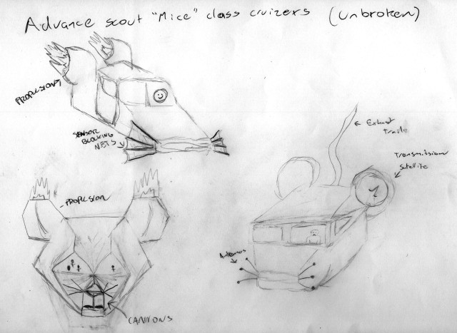
One of the things we were challenged to do while developing the characters for ‘Three Blind Mice’ was to come up with some iterations that weren’t mice. My thought was to make them space ships.

Three different ideas for the ships.

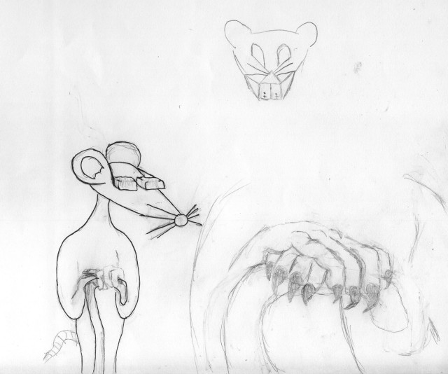
What I thought was the final attempt on this idea, the ship became the head for a character I developed further.

This guy started as a ship.

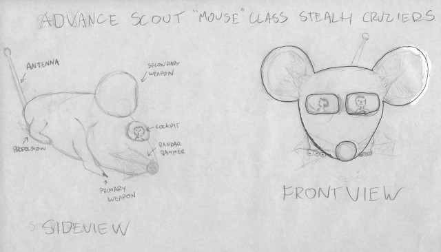
Shortly after, we were given a new assignment that would use our designs to create a storyboard for a game, so I revisited the ship idea.

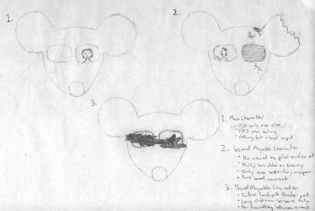
To make the ships individual, I gave them different damage.

But I once again moved back to creating actual characters.

Towards the end of my design sketches I started to experiment with the use of question marks and exclamation marks, as can be seen in my last post of my design journal. While doing this I noticed that, when put together the right way, you can kind of make it look like a person. That lead to the sketch below.

The illusion's not quite there.

After sketching this I began experimenting with what is supposed to be the speech bubble.

Then it was suggested to me that I should try using fonts that already exist to create the design.

After sorting through fonts for a question mark that will enhance my concept, I combined it with the font ‘Gill Sans’ to create the iteration below.

Checking out various ?

.

Then I messed around with the placements of the elements to see if the effect held up.

In the book “Hero With A Thousand Faces”, Joseph Campbell put forth the concept that every story in the history of man has been the same basic tale. Or at least follows the same formula.

For our first solo storyboard, we asked to create a storyboard for the third stage of Joseph Campbell’s omni-tale.

  • The hero denies the call to adventure.

Below is a quick attempt at this task, that took half the time we were given in during class.

What this storyboard hopefully shows it a guy playing video when the phone rings. This breaks his concentration and causes him to lose his game. He totally ignores the phone itself and goes to the kitchen to get a drink. By the time he gets to the kitchen the phone has stopped ringing, but starts again while he has he head in the fridge. He continues to ignore the caller and goes back to his game, but before he starts playing someone, possibly the person calling on the phone, throws a rock through the window with a message attached.

Because I had more time to finish the storyboard, I decided to redraw some of the more important frames in greater detail. I redrew the following three scenes before running out of time.

The next scene I would have redrew is the shot from within the fridge.

“I can’t understand why people are frightened of new ideas.
I’m frightened of the old ones” – John Cage

After coming up with a name for my company, I began brainstorming ideas. After looking at some of the ‘would-be’ competitors and there logos/marketing. I found a few Australian companies on the web and learnt that the more entertainment based designers had animated logos.

From this I decided that I decided that I should come up with animated logo for my animation company. In the first concept I had thoughts, (the letters spelling “Random Thought” falling out of a box. A play on the cliché ‘Thinking outside the box’. In the top left hand corner of the image below, you can see where I sketched this first idea.

If you follow the arrows you may notice how the design evolved through slight iteration in typography, (except for the brain design, I have no idea where that came from), into the full-page sketch below.

'Thought' created with pen tool.

After taking this design into Illustrator, I sat down and drew up a few different iterations.

These images lead to the two iteration below and a third idea that will be discussed in the next post of my design journal.

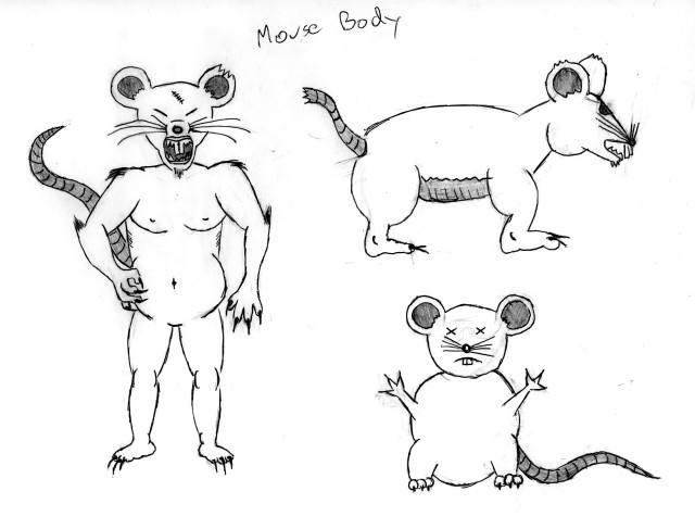
For the project D1-1 the class was given the task of designing characters for an animation based on the three blind mice that was marketed for mature audiences.  The image had to evoke empathy for the mice and the scene had to be tense and uneasy.

These first iterations were to see what type of mice I could draw best.

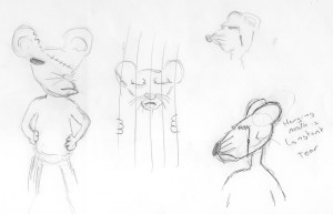
This set of drawings are an exploration of personalities.

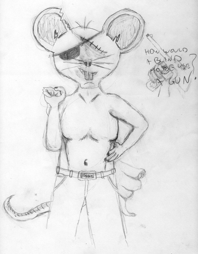
When asked to create a hero iteration I developed this one more.

Below are my attempts at creating a logo using the different laws of gestalt. Except for the last image which was something made during a class exercise.

The logo was given to me

An exercise in Texture

During class we went through an exercise in using textures were we were given this logo that our lecturer made and then used Photoshop to create a textured background give the logo a bit of scratched look. But afterwards we had to use the same logo and recreate the exercise using our own textures and concepts. The one above was created by me using only the original logo.

Some of the work I’ve done so far this year.

When I get back to TAFE, I’m going to start scanning some of my drawings from this first term, (which will be last term by the time of next post.