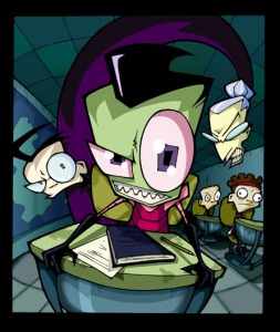
Archive for April, 2010


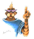
I don't know who this is.

I don’t know who this tiger is or what he was meant for but he was given to me by my lecturer as an example of bad design. Why did he do that?

Firstly the proportions are all off. HIs hand is bigger than his face, and if he were to lower that hand, it would come down to his knee. Beyond that it’s a little hard to judge because, as stated, I don’t know what this tiger was made for.

The assumption I am making is that this was aimed at kids and young teens. That is only an educated guess, but it is on this that I base the rest of my critiques.

The shades were probably put there because the designers thought it would make the tiger cool. Not only are his eyes now hidden, the shape of the lens’ was a terrible choice. If a person is to appear friendly it helps if they have large round eyes. The shades make his eyes uninviting. In fact his whole face it rather angular and harsh.

His shirt just looks stupid. The colour a poor choice.

In the end, I think this character was created based on a grown ups belief of what he thinks a boy would find cool, on not on research into the market. Instead of the funny and hip character I think they were aiming for, we have a rather intimating figure.

Sometimes called dominance, emphasis in provides the focal point for the piece. It creates a focal point by making one element of the design more prominent than the others. Emphasis can be created using all of the various elements and principles of design.

  • The Rider's red shirt creates a focal point

    Contrast

  • Proportion
  • Balance
  • Proximity
  • Repetition
  • Space

A focal point is an area where the eye tends to center. It is the focus of the viewer’s attention. In realistic art the focal point is usually quite easy to spot. Larger figures, usually found in the foreground, provide a focal point. An artist can isolate an object with space or colour. Differentiating the focal point is another technique. If most objects are horizontal, a vertical figure will stand out. Or if an object is better render than the surrounding objects.

When there is dominance there must be subordination (things lower in ranking). In art this means that some things get more attention and some get less. To figure out what should be the emphasis of your design, you must first figure out the main message you want to send to your audience.

In the logos below the designers send a strong message using emphasis.

The sites below have great information about creating emphasis;

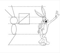
Bugs was designed with adult proportions

In character design ratio refers to the proportions of the body parts in relations to the rest of the body. Take Bugs Bunny for example. All of his limbs, including ears, are the same height and are in proportion to his head, giving him the look of an adult human. The proportions are based on;

The Golden Ratio – 1.618. This is a ratio that appears not only in design, but nature itself. It is the ratio between any two element. When the smaller section is compared to the larger section it should create a ratio of 1.618. And when those two elements compared to the next larger element you should get the same result. In Bug’s case – Hand x 1.618 = Face x 1.618 = Arms x 1.618 = body. Ergo the section of a person’s leg, the distance from waist to knee and knee to foot, should reach this ratio with the leg itself.

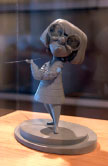
Edna From The Incredibles

Fibonacci Sequence – is another ratio with set mathematic but is a little easier to understand. If you measured up Edna, starting with her feet and worked your way up, you might notice that each section is equal to the sum of the lower two section. This is the Fibonacci Sequence, where every number is equal to the proceeding two numbers, (1, 1, 2, 3, 5, 8, 12, and so on). This sequence also naturally occurs throughout the universe and is very close to the golden ratio. If you divide the larger numbers in the sequence by the proceeding number you will get approximately 0.61. Some of the equations will come out at 0.618, but not enough to claim these as the same rule.

You may be thinking that Edna is a very strangely shaped woman so the Fibonacci Sequence can’t be good for character design. On a normally proportioned character the largest number of the sequence would be used for the distance from the top of the head to the waist. But when Edna was designed, the animators wanted to emphasis her face.

Why?

Face-ism Ratio – which is the ratio of face to body. In photographs where the face takes up most of the frame, (high face-ism ratio), the viewer focuses more on the personality and intellectual attributes of that person. If the photograph has a low face-ism ratio, (the face only take up a small part of the frame and more of the body is shown), then the viewer generally focuses on the physical aspects of the person in the picture.

They want you to want her.

Pixar wanted Edna to appear highly competent, intellectual and worldly. Which they achieved by making face stand out to the audience. Unlike this final character, whose name I don’t know, whose face is proportionally small. The animators have made her legs the main focus as long legs suggest full maturity. They have tried to make this character desirable by giving her long limbs and using the;

Waist to Hip Ratio – which has created a prefered ratio of 0.7 for women and 0.9 for men. This is because of estrogen and testosterone and their effect on fat distribution. High estrogen level result in a low waist to hip ratio, while high levels of testosterone result in a higher waist to hip ratio. We respond to this ratio because they are reasonably indicative of health and reproductive ability.

If you want to know more, the following sites have great information about the mathematics and biases of human proportions;

Composition

Boris Vallejo - "Warrior On Unicorn Versus Dragon"

The term composition means ‘putting together,’ and can apply to any work of art, from music to writing, that is arranged or put together using conscious thought. In the world of visual media composition is the placement or arrangement of visual elements of the work to give clarity and order to the idea.

Composition is about the way our eyes are guided around the artwork. It is involved with how the elements of the artwork go together to form a wholeness. The individual elements don’t have to form one shape but, if you seek composition the text and the artwork has to seem like one. I feel the artists below have achieved that affect with their logo designs.

All 3 Figures are the same size

A simple way to explain the concept of balance is to look at something that isn’t balanced. In the Optical IQ test question on the right, the viewer is asked to point out which figure is the largest. In a three-dimensional world the answer would be the one on the far right. But two-dimensionally, the three figures are the exact same size. The figures are out of balance. In order to make the figures appear the same size to the viewer, their height would need to be adjusted in respect to the perspective drawn.

Many of the principles of design can be demonstrated through optical illusions. Check out some of the illusions here.

When creating a logo, there are a number of things that can put an image out of balance. Perspective is just one example. Others include background colours, value, and shape. Balance is achieved when the various components within a logo design are visually equal. There are three types of balance; symmetrical, asymmetrical, and discordant (or off-balance).

I collected the three logos below in an attempt to demonstrate active use of balance and what stand in the way of achieving it.

For more on the principle of balance in art and design click one of these;

The unusual use of the baby face bias makes us uneasy.

Baby Face Bias – We tend to see people with baby-face features as being more naive and helpless, innocent and honest, than people with mature facial features. ‘Baby-face features’ include round features, big eyes, small nose, high foreheads and high chins.

If we look again at the band Gorillaz you can see that the baby-face proportions are in place but it has been deviated by the replacement of certain aspects. Some have beady eyes, others have low foreheads or big noses. This throws us off because of another bias.

Princess Clara

Attractiveness Bias – In Gorillaz the have been given asymmetrical and exaggerated features which is in contradiction to the baby-face bias. This puts us off because of the attractiveness Bias. Attractive people have a tendency to appear more intelligent, moral and friendly. Inversely, unattractive people come off as shifty, slow and unsociable. It’s these things we see in the Gorillaz’s characters that make us uneasy.

So we know that people tend to like attractive people more, but what is considered attractive? Just take a look at Princess Clara o the left. Would you say she looks innocent and friendly?

Most Average Facial Appearance Effect. People with facial features closer to the average of the population are considered more attractive. In Princess Clara’s case, she was given big eyes to make her appear innocent, (baby-face bias), and the rest of her features are underplayed and of average proportions, (attractiveness bias). This has created an apparently trustworthy and moralistic character. This is because of yet another bias.

Would you approach this guy?

Classical Bias – You may have figured out that Clara is a conglomerate of classical Disney princesses. She is in fact a send up of those character from a show called Drawn Together which takes her to many dark places Disney wouldn’t go near. The reason this is so strange is because we are classically conditioned to see pretty young woman as sweet and innocent, (and most times in need of protecting). Another example is big, unattractive men being seen as menacing and slow-witted.

Classical conditioning is something we learn from social input at a young age. Much like the attractiveness bias and average facial feature effect, the biases it produces are culturally different. What is considered average or attractive changes around the world. So know the mindset of your audience.

Mickey Mouse

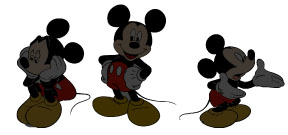
Mickey's ears are always the same shape

When you watch Mickey Mouse you can notice that the shape of his ears are consistent no matter at what angle Mickey is standing. This distinctive shape allows Mickey to be quickly and easily recognised, even at a distance.

When creating a character, keep in mind that it wont always be front and centre. If your characters are in the distance, in shadow, or otherwise impeded, a viewer should always be able to tell which character is which.

Another example of using distinctive features and consistent shape is the virtual band Gorillaz. The music is created by real people, but each member of the band is presented to the public as a two-dimensional illustration, (the characters are also animated for the music clips). Thought not as well-known as the image of Mickey Mouse, these characters are unmistakable to the fans. Individuality is in the form of hats, hair styles and other accessories. These thing are also smaller details than Mickey’s ears, (other than some of the hair), but when put in combination which consistency of shape they mark each character.

Gorillaz Album cover

Some of the work I’ve done so far this year.

When I get back to TAFE, I’m going to start scanning some of my drawings from this first term, (which will be last term by the time of next post.

Created by Jhonen Vasquez Somewhere in the galaxy in an advanced race of green men, whose military hierarchy is decided by height, are waging war on the universe in their new campagne – “Impending Doom 2”. That’s right, the first one failed but the brought out a sequel. This one’s sure to work since their leaders, The Almighty Tallest, has banished the Irken solely responsible for the failure of Impending Doom 1, Invader Zim, to the other side of the galaxy.

But to convince Zim to leave and stay far away from anything important, they told him that there was an inhabited planet somewhere in that area and his ‘mission’ was to prime it for invasion.

Little did the tallest know that there actually was an inhabited planet there. It was called earth and the humans don’t know, (or care), whats coming.

After building his base, Zim decided that the best way to learn about earth is to enroll in High School. There he met his classmate Dib. Dib can see through Zim’s disguise but everyone else thinks Dib is just crazy and Zim is just ugly.
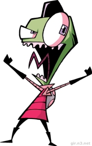
Zim with his Disguise
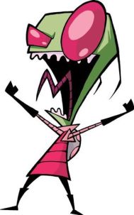
Zim without his disguise

I once described Zim as that one kid who always took the game too seriously. Though he is slow-witted, unlucky and physical weaker that the beings he plans to conquer, Zim is ludicrously sure of his superiority. He takes credit for other’s misfortune and has a train of logic that goes way beyond delusional.

The earth presented by the shows creator Jhonen Vasquez would be easily conquered as the humans of the near future are dull and unobservant. As Dib once put it – “It’s almost as if earth wants to be taken over.” They can’t even see through Zim’s disguise. The addition of pupils and hair, make Zim seem less dangerous, but far more evil. Also note the change from ignorant to stupid when the disguise is put on.
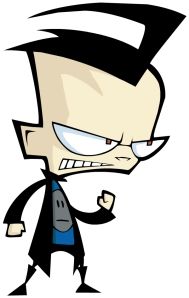
Dib. Why is his head so big?

As mentioned, there is one human that is on to Zim, his archenemies Dib. Dib is a budding paranormal investigator with an overly large head. This is a metaphor for the weight Dib feels he is carrying on his shoulders. He is the only one that can foil Zim’s plans, (not that Zim’s plans ever come close to succeeding). With the addition the hook-ish hair style, (which he did once use as a hook), Dib’s head is a highly recognisable object from any angle.
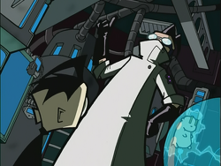
Professor Membrane

And it’s not only the coming alien invasion that no one believes in. Haunted gummi bears, spell drives, Mortos Der Soulstealer and the foul curse of the Shadow Hog are but a few things that not even Dib’s father, Professor Membrane, is willing to believe. That’s Membrane to the right, the guy wearing a lab coat as though it were Superman’s cape.
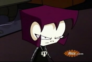
Dib's Sister Gaz

In spite of all the evidence Dib’s collected, he has only ever convinced two people that Zim is an alien. One left the earth and the other is his sister Gaz, who doesn’t see Zim as a threat and so still doesn’t care. In fact Gaz has come closer to killing Dib than any of the monsters and aliens he has encountered. Gaz is a serial gamer with very little concern with the world outside her game screen. The hair style they gave her makes head square from every angle. Almost like she’s boxed in.

Though most well-known for Invader Zim, Jhonen Vasquez created one of my favorite comics book called Johnny The Homicidal Manic, as well as some other titles and different projects.

Johnny The homicidal Maniac

For more on Invader Zim or Jhonen Vasquez click one of these links;

Value is the play of shadow.

Value is the relative degree of lightness and darkness in a design element. Value is relative to the background color and other items on the page.

The value of colour increase or decreases to give extra dimension to an image, but in this case, value also refers to the creation of shadows.

Value can give an image a shinny veneer or a dark tone. It can create a feel of distance or movement. And is used in the creation of textures

Dark areas tend to denote gloom, mystery, drama or menac. Light areas tend to denote happiness, fun, gaiety, warmth and closeness

    The three logos below demonstrate how other people have used value;

    Value is little discussed as an element of design, but here are few sites that do just that;