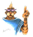
I don’t know who this tiger is or what he was meant for but he was given to me by my lecturer as an example of bad design. Why did he do that?
Firstly the proportions are all off. HIs hand is bigger than his face, and if he were to lower that hand, it would come down to his knee. Beyond that it’s a little hard to judge because, as stated, I don’t know what this tiger was made for.
The assumption I am making is that this was aimed at kids and young teens. That is only an educated guess, but it is on this that I base the rest of my critiques.
The shades were probably put there because the designers thought it would make the tiger cool. Not only are his eyes now hidden, the shape of the lens’ was a terrible choice. If a person is to appear friendly it helps if they have large round eyes. The shades make his eyes uninviting. In fact his whole face it rather angular and harsh.
His shirt just looks stupid. The colour a poor choice.
In the end, I think this character was created based on a grown ups belief of what he thinks a boy would find cool, on not on research into the market. Instead of the funny and hip character I think they were aiming for, we have a rather intimating figure.

